Your web browser is out of date. Update your browser for more security, speed and the best experience on this site.

Update your browser
CapTech Home Page

Client

Hillsborough County

Industry

Public Services

Challenge

Hillsborough County had an online visual identity that no longer represented the government as it truly was. Additionally, their website was difficult to manage and use, resulting in an excessive amount of website support calls from residents.

Results

The new online presence for Hillsborough County has been well received and the new logo immediately embraced and applied across various applications throughout the county government.

After implementing the redesigned website, Hillsborough County observed:

  • A 26% improvement in users’ belief that the new website’s design is “High Quality” compared to the old website on the same measure.
  • Less IT involvement is required in website management reducing resources.

The county government’s website is now positioned to serve as the primary source for county-related news. Users can also access content easily and enjoy a customized experience on any device from anywhere in the world.

9%

Increased Success Rate for key tasks

71%

Decrease In task completion time

Design, Develop, Deliver

Hillsborough’s initial request was an overall redesign and build of the county website on Sitecore.

This process began with a content audit which involved analyzing thousands of pages. We then created and delivered prototypes of the redesigned site using wireframes and a handful of adaptive templates.

  • Using brand workshops, CapTech’s Customer Experience practice collected information defining what Hillsborough County stands for and, by highlighting a historic piece of the Tampa skyline, created a friendly, modern logo identity.
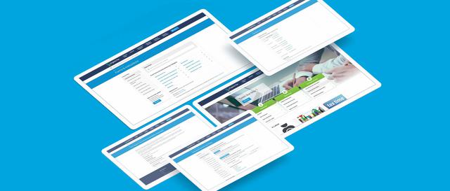
  • The website was reimagined using best practices in user experience research, a state-of-the-art content management system, and clean modern visual design. The outcome of the design promoted a consistent, fluid experience across mobile and desktop devices.
  • Using card sorts and an interaction design method, the website’s content was completely reorganized to be more intuitive than the previous services-by-department taxonomy.

Related Content